As a professional web designer the focus is always on finding clients and aligning my ideas with theirs. Every client has a general idea of what they want when it comes to their website or how they want it to generally look. If a web designer in Cardiff cannot understand the core of what a client aims to portray online through his or her website, then no design will be good enough. It’s all about focusing on the right overall theme, colour scheme, content, image placement or overall layout. So this is what I did for Video Productions company.
How the Theme Came About
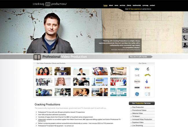
Every company or business owner would have an overall objective or theme they want to portray for their company. For instance, some brands may want to be considered youthful while others would like a more mature image. The image is portrayed accordingly by designers via online content or print media. As a web designer company, I sat with my design client, understood their core goal and image and thought of using pictures to highlight their essence. The overall theme is image based because a production company essentially deals in images and videos. The home page itself showcases client’s portfolio – a great way for a new potential client to immediately see what Crackling Productions is all about.
Why it Looks Different?
Most websites have the Home, About Us, Who we Are and other similar sections. As a designer I can easily play around with this. While I obviously couldn’t disregard these sections, I didn’t make it the first thing you see on visiting the page. That is because, what the company does should come out as soon as you visit the site. It saves time and focusing on images and keeping the tabs up on the corner made sense here.
The Focus on Functionality
If you add too much on your website, it becomes harder to manoeuvre and read everything. The website should be functional and easy to read. Even with a quick glance, you can see how easy it is to skim through the services the production company offers and what they do.
Colour and Content
White and black are the basic colours to keep content simple. It helps to play around with image and image quality but when it comes to the site content, the size and its layout should be planned smartly. The Video Productions website’s home page sports a simple black and white content colour. This makes it easy to read. The sub sections too have the same colour coding with variation of font and shades to go with what is being said on the page.
Image Quality
As the cardiff designer working on this, the quality of the images for the production company website had to be at it best. The challenge was in placing good quality images at the right places to showcase the core services. This is why you will find that the images become the main focus on this site