Medical Web Site Design for a South Wales Client
Creating websites requires sustained effort and a lot of creativity. In addition to these basics, you need to have the ability to identify with the image of the industry your client represents. A web designer has to be creative enough to make a funky fashionable website for a boutique on one day and then a more formal toned website for a medical company or doctor on another. This is obviously subjective, its important as a designer I represent the colour, design, graphics and layout of a website meant for medical purposes.
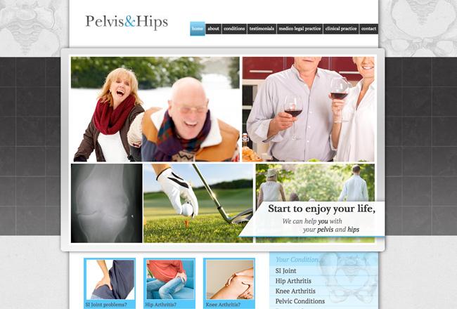
When I was working on this business's website, the idea was to create a website that is rich in content, simple in design, yet interesting. Making a formal medical website is the usual way forward, but there is no rule against adding some colour and fun to the pictures and layout. How else would a target customer or potential patient feel good by reading the website?
I focused on using big size images as the main design for the web site cover page. The images showcased happy older people, which in one way represent the people that would ideally suffer from the medical problems the doctor in concern deals in. I used some happy family style portraits too, to indicate freedom from the pain of arthritis and related ailments, the main illness the doctor here focuses on. When you visit a website, especially one that offers a particular service, you would need to feel a sense of comfort in order to continue reading it.
Since the tone had to be more formal, I used basic shades of blue and white. It’s simple, easy to read and showcases a mature image. Blue is also comforting in many ways and also represents the medical sphere to a large extent. Since this was a more service oriented website that focused on healing people with medical conditions, it made sense to use a more content rich layout. Readers need to understand what the doctor is talking about, what he can offer them and related facts. Segregating the information under appropriate tabs was an important task. In a medical website, you have to be clear about what you want to say and how to say it. You cannot bore the reader but you cannot be too brief either. So, in a way, the website had to be content rich.
The main challenge was representing all of this is a creative yet formal manner. With the use of right colours, shades and placement, I think it worked out pretty fine. The site looks mature, reader friendly and is informative enough. Interested readers will after all need to seek appointments to follow through! I’m glad as a freelance designer in Cardiff I got to work on this.