Working on the design of the vintage home needs and lifestyle store was a real delight. Owing to the nature of the website, I needed to push my creativity to another level and come up with a design that had a very elegant vintage appeal, without looking boring or dull.
I have recently had numerous queries from people who want to know more about selling products online. The main benefit of selling online is that you can expand your reach beyond geographic boundaries. Furthermore, maintaining and operating an ecommerce portal is easier and more cost effective than a physical store.
The client
The client is a seller of vintage goods online. The product catalogue includes cutlery, books, dressing table sets, jewellery, sewing materials and accessories, and several other products related to home and lifestyle.
Target customers
Target customers of the website are all those who like vintage products for their homes. The products are not very expensive and hence, cater to a wider section of consumers.
Design challenges
I don’t mind confessing that this is one of the most interesting projects I have handled.
The first, and the biggest challenge was to infuse a vintage appeal into the website. Secondly, the website needed a lot of work. For one, the client’s previous website did not have online selling features. So, a complete ecommerce portal had to be designed. The third challenge was to create a website that could help the client in their rebranding campaign.
The design
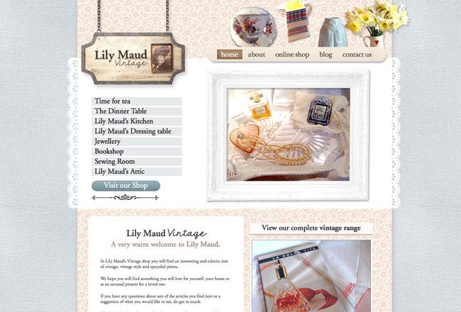
I spent a lot of time coming up with a layout plan and colour scheme. The objective was clear – to create a vintage appeal. So, after a lot of brainstorming, I finally came up with a layout that subtly reflects Victorian home interior theme.
Instead of using solid coloured background, I have used a typical vintage printed wallpaper style in a soft baby pink colour. This, by itself, creates an old-world charm to the site. Using a wallpaper serves another purpose. It creates a homely feel to the page, which is in tune with the type of products sold on the website.
The wallpaper pattern is used strategically on the page along with white spaces in order to make the page look spacious and pleasant. Furthermore, I have used a light grey floral printed border to enhance the vintage appeal.
If you notice, ornamentation of the page is purely vintage, be it the use of a wood nameplate suspended on a link chain, the simple detailing under the “Visit our Store” button or the images in the header section.
The heavy picture frame on the Home Page, which is used instead of the conventional slideshow has an old world charm as well.
The Home Page also has a prominent list of categories in order to simplify navigation on the site. The other pages of the website follow the same layout pattern. However, each page is customised as per its purpose. For example, in the product page, I have used pictures to depict categories.
Since the website is an e-commerce portal, I have included a user-friendly shopping cart. The check out process is easy too.
With its instant connection to vintage, the open and friendly feel, and functional features, this website helps in branding, customer engagement and easy selling.
The client says that it is perfect!


https://www.rhyswelsh.com/about/blog/case-study-vintage-website#sigProId19e67ea5bb